Segmentation Calculation#
This page demonstrates how to use tab-right’s segmentation calculation (SegmentationCalc) and its plotting functionality.
What is Segmentation Analysis?#
Segmentation analysis is a powerful technique for understanding how your model performs across different subsets of your data. Tab-right provides comprehensive tools to:
Calculate metrics for each segment of your data
Visualize segment performance with built-in plotting functions
Compare multiple segments to identify potential model weaknesses
Using tab-right for Segmentation Analysis#
Tab-right provides the following key components for segmentation analysis:
SegmentationCalc- Core class for calculating metrics across segmentsplot_single_segmentation/plot_single_segmentation_mp- Visualize segment metricsDoubleSegmPlotting- Visualize interactions between two segment features (supports both plotly and matplotlib backends)
Basic Usage#
Here’s a simple example showing how to create segment data and visualize it:
import pandas as pd
import numpy as np
import matplotlib.pyplot as plt
from tab_right.plotting import plot_single_segmentation_mp
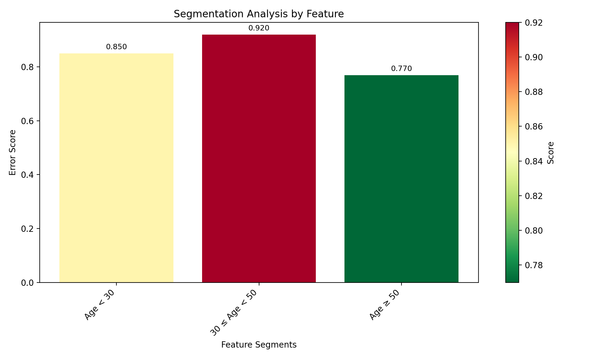
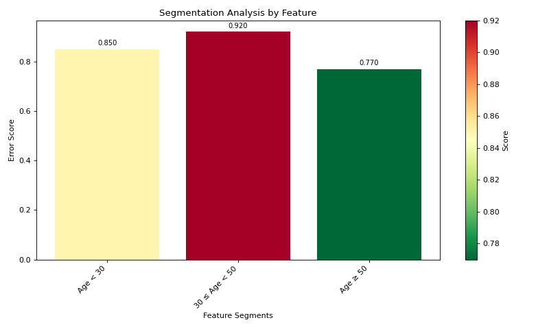
# Create a simple results DataFrame with segments
segments = pd.DataFrame({
'segment_id': [0, 1, 2],
'segment_name': ['Age < 30', '30 ≤ Age < 50', 'Age ≥ 50'],
'score': [0.85, 0.92, 0.77]
})
# Plot the segmentation results using matplotlib
plot_single_segmentation_mp(segments)
plt.show()
(Source code, png, hires.png, pdf)
Working with Actual Data#
For real-world analysis with your own data:
import pandas as pd
import numpy as np
from sklearn.tree import DecisionTreeRegressor
from sklearn.metrics import mean_absolute_error

# Create DataFrameGroupBy object with segment information
df = pd.DataFrame({
    'age': [25, 28, 35, 42, 55, 60],
    'segment_id': [0, 0, 1, 1, 2, 2],
    'true_value': [10, 12, 15, 14, 20, 18],
    'prediction': [11, 13, 14, 16, 17, 16]
})

# Group by segment_id to create the DataFrameGroupBy object
grouped_df = df.groupby('segment_id')

# Create mapping from segment_id to readable names
segment_names = {
    0: 'Age < 30',
    1: '30 ≤ Age < 50',
    2: 'Age ≥ 50'
}

# Define metric function (MAE)
def calc_mae(y_true, y_pred):
    return mean_absolute_error(y_true, y_pred)

# Create segmentation calculator
from tab_right.segmentations import SegmentationCalc
seg_calc = SegmentationCalc(
    gdf=grouped_df,
    label_col='true_value',
    prediction_col='prediction',
    segment_names=segment_names
)

# Apply metric to calculate segment scores
segments = seg_calc(calc_mae)

# Plot the results
from tab_right.plotting import plot_single_segmentation_mp
plot_single_segmentation_mp(segments)
plt.show()
Visualization with Higher-is-Better Metrics#
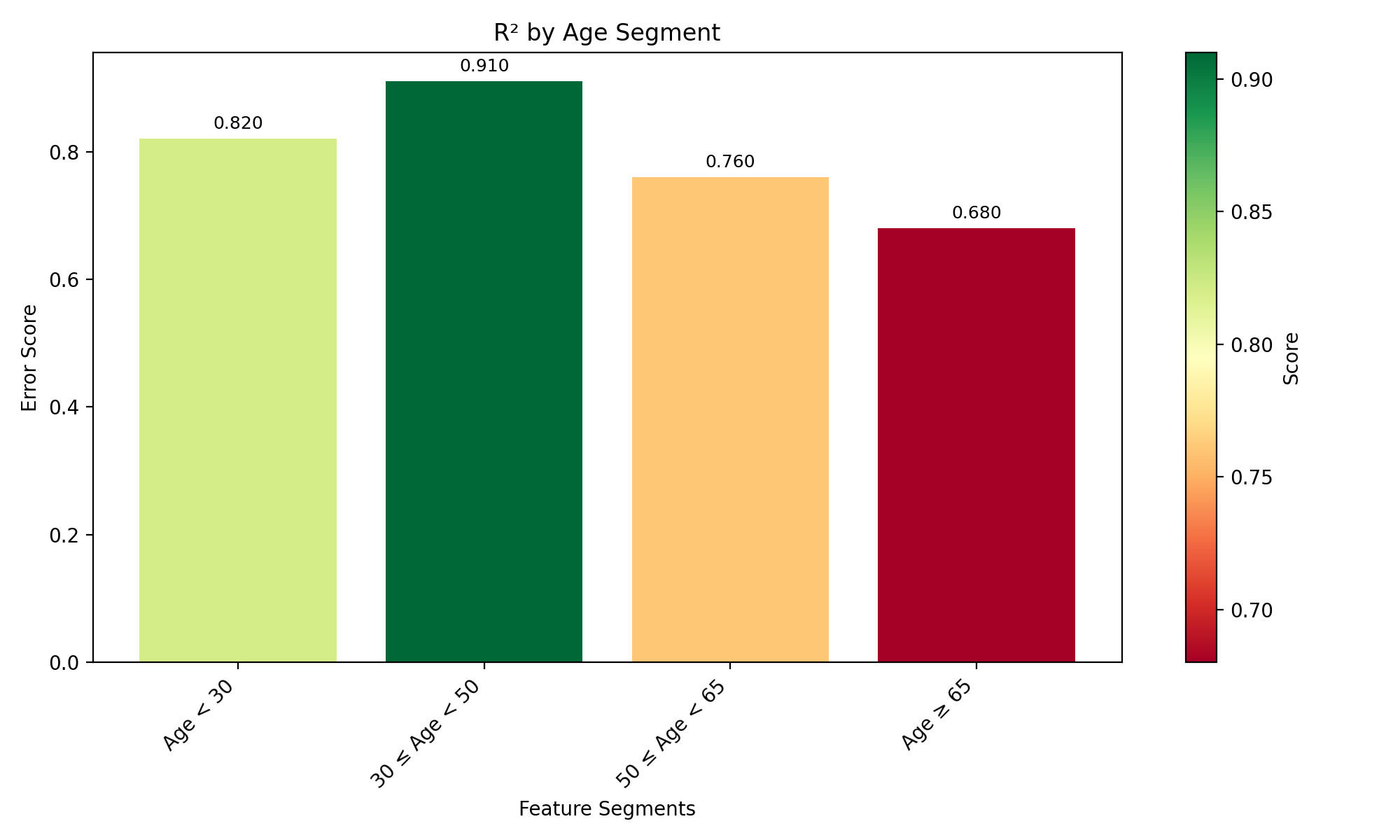
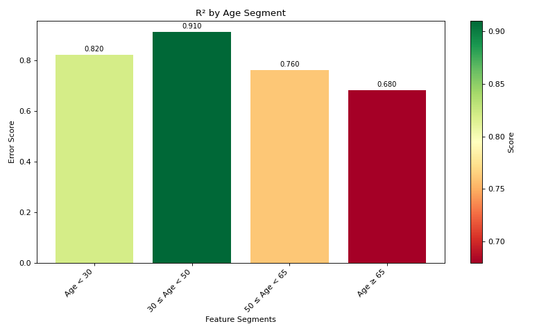
For metrics where higher values are better (like R²), use the lower_is_better=False parameter:
import pandas as pd
import matplotlib.pyplot as plt
from tab_right.plotting import plot_single_segmentation_mp

# Create a DataFrame with example R² values by segment
r2_segments = pd.DataFrame({
    'segment_id': [0, 1, 2, 3],
    'segment_name': ['Age < 30', '30 ≤ Age < 50', '50 ≤ Age < 65', 'Age ≥ 65'],
    'score': [0.82, 0.91, 0.76, 0.68]  # R² values (higher is better)
})

# Plot with lower_is_better=False for R²
plot_single_segmentation_mp(r2_segments, lower_is_better=False)
plt.title("R² by Age Segment")
plt.show()
(Source code, png, hires.png, pdf)
Interactive Visualization with Plotly#
Tab-right also supports Plotly for interactive visualizations:
from tab_right.plotting import plot_single_segmentation

# Create interactive visualization
fig = plot_single_segmentation(segments)
fig.show()  # Opens in browser or notebook
Key Steps for Segmentation Analysis#
Group your data by segments using pandas’ groupby function
Create segment names for better interpretation of results
Initialize SegmentationCalc with the grouped data
Apply a metric function to calculate segment scores
Visualize the results using plot_single_segmentation_mp (matplotlib) or plot_single_segmentation (Plotly)
This workflow makes it easy to identify segments where your model performs differently, helping you understand where improvements are needed.
Key Benefits of Using tab-right for Segmentation#
Standardized API: Consistent interface for all segmentation analyses
Automatic handling of missing values: Robust processing of incomplete data
Support for multiple metrics: Easy comparison across various evaluation metrics
Flexible visualization options: Both static and interactive plotting
Compatible with scikit-learn: Works with any scikit-learn compatible metric function
Tab-right’s segmentation functionality helps you understand where your model performs well and where it needs improvement, enabling targeted model enhancements and better decision-making.